
Beyond Product Listings: Designing Decision-Oriented E-commerce Interfaces to Reduce Information Overload
Many medium-sized enterprises (SME) e-commerce websites share a common characteristic: upon entering the site, users are quickly presented with a lot of products, technical specifications, and differences between various models.
This structure seems logical. After all, the core task of an e-commerce website is product display. However, this design often rests on the implicit assumption that users already know what they are looking for and how to compare different products.
However, reality is not always so straightforward. For users familiar with the products, specifications and parameters help them quickly filter through the selection process. But for users lacking relevant knowledge, the sheer volume of technical information becomes a burden. They are asked to compare products before they truly understand them. This is a paradox faced by many e-commerce websites: the information provided is increasing, but users are not necessarily making decisions easier.
From a user experience perspective, the problem may not lie in the quantity of information itself, but in the order in which it appears. Traditional e-commerce websites typically place ”product comparison” early in the user journey. Users need to browse multiple product pages, understand various parameters, and independently determine which information is relevant to their needs. However, for many ordinary consumers, the primary question is not ”which product is better,” but rather ”what product do I actually need?” Therefore, a question worth considering is: should websites first help users narrow down their choices before proceeding to the product comparison stage?
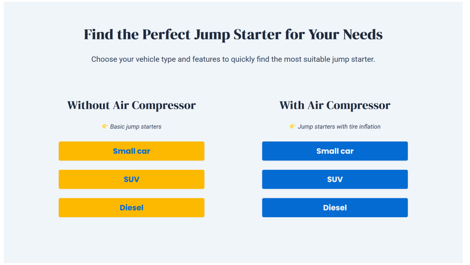
Decision-oriented interface design is based on this idea. Unlike traditional structures, it doesn’t rush to display all products, but rather helps users establish a sense of direction first. For example, it guides users to gradually narrow down their choices by using scenarios, need types, or key uses. Once users have clarified their needs, they then proceed to specific product pages and detailed comparison sections.
This approach doesn’t reduce product information, but rather rearranges the order in which information is presented. This is particularly relevant for small and SMEs. Many SMEs lack the resources to develop complex recommendation systems or AI tools, but by adjusting information architecture and user flows, they still have the opportunity to improve the overall website experience.
Therefore, improving the user experience of an e-commerce website doesn’t necessarily mean adding more features. Sometimes, the more important question is: what should users see first after entering the website, and how should the website help them make a decision?
In the increasingly competitive e-commerce environment, successful websites need to not only showcase products but also help users make choices.
Source: Zheng, W. (2026). Designing and Implementing a Prototype WordPress E-Commerce Website for SMEs: A Functional Approach to Usability and Performance. Bachelor’s Thesis. Turku University of Applied Sciences. Available at: https://urn.fi/URN:NBN:fi:amk-2026053019594 (Accessed: 1 June 2026).